An ocean salinity map uses color to show how dissolved salt varies across the sea. Begin with the legend, because the colors have no universal meaning. Then check whether the map represents the surface or a deeper level, a single date or a long-term average. Those choices determine what every pattern can support.
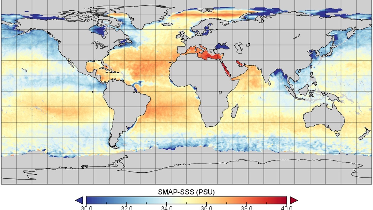
Most global maps show practical salinity near 35 across the open ocean, with fresher colors near rainy regions or river mouths and saltier colors in dry subtropical zones. NOAA’s World Ocean Atlas access page provides analyzed salinity fields across standard depths and time periods.
A map should be read as a gridded dataset, not a photograph of salt. Each cell may come from direct measurements, objective analysis or a satellite retrieval. The chosen color range changes the apparent contrast. Resolution and missing data determine how much detail deserves confidence.
Start with units and the color scale
Salinity maps may use practical salinity units, parts per thousand or grams per kilogram. Practical salinity is technically unitless, although many graphics label it psu. Near ordinary seawater, these numerical values are similar enough that global patterns still center around 35.
Read the minimum and maximum printed beside the color bar. A scale from 30 to 40 emphasizes normal marine differences. A scale from zero to 40 includes fresh water and compresses open-ocean variation into fewer colors.
Some legends use equal numerical intervals, while others select breaks that highlight a scientific threshold. A map can also reverse the expected palette, assigning warm colors to fresh water. The numbers remain authoritative.
Check depth before interpreting a pattern
A surface map responds directly to rainfall, evaporation and river discharge. Satellite salinity products represent only a thin skin at the top. Ship and float maps may use a standard depth such as 10 meters to reduce immediate surface noise.
At 100 meters, the pattern can be very different because currents carry water below the mixed layer. Deep maps trace water masses formed in particular regions. A fresh surface cap does not prove that the whole water column is fresh.
The World Ocean Atlas provides fields at multiple standard depths. Its main product page describes objectively analyzed, quality-controlled means based on profiles in the World Ocean Database. Comparing depths reveals a three-dimensional ocean that one surface panel cannot show.
Distinguish a snapshot from climatology
A daily satellite map can capture a fresh plume after rain or seasonal river discharge. Cloud does not block microwave salinity sensing in the same way it blocks visible imagery, but rain and rough seas can reduce retrieval quality.
A monthly composite combines multiple passes and reduces noise. A climatology averages many years to show the expected seasonal or annual pattern. It is useful as a baseline but cannot describe conditions on a particular day.
Look for the date and whether the label identifies an anomaly, a mean or a climatology. An anomaly map subtracts a reference average, so zero means normal for that place and season rather than zero salinity. Positive colors indicate saltier-than-reference water.
The NOAA World Ocean Atlas documents which years contribute to each field. Long-term means may smooth extreme floods and narrow currents, which is a feature for climate comparison but a limitation for navigation.
Recognize the broad global pattern
Subtropical regions tend to be salty because evaporation exceeds precipitation. The saltiest broad open-ocean surface zone often appears in the subtropical Atlantic. Enclosed warm seas with restricted exchange can reach still higher values.
The equatorial belt is relatively fresh under heavy rainfall. High latitudes are also fresher because precipitation and ice melt add water. Freezing sea ice rejects salt locally, creating seasonal contrasts that can be hidden in an annual mean.
The Atlantic is generally saltier than the Pacific. Atmospheric circulation exports freshwater from the Atlantic basin and ocean circulation maintains the difference. A map shows the result, while an explanation requires water-budget data and currents.
Follow river plumes and current boundaries
Major rivers create low-salinity tongues that spread along coasts or into the open sea. The Amazon plume can extend across a large part of the tropical Atlantic. Its position changes with discharge, winds and currents.
Sharp color boundaries may mark fronts where different water masses meet. Currents stretch these fronts into filaments and eddies. A narrow feature close to the map’s grid size should be treated cautiously because smoothing can shift or weaken it.
Coastal pixels are difficult for satellite retrieval because microwave emission from land contaminates the ocean signal. Gridded atlas products may also have fewer observations near ice or in remote seas. Quality flags and data-count maps help distinguish a real feature from weak coverage.
Resolution controls what the map can show
A one-degree grid spans roughly 111 kilometers north to south. Quarter-degree products add detail but do not guarantee observations at every cell. Analysis methods interpolate between measurements using physical distance and statistical rules.
Satellite footprints may cover tens of kilometers, then be resampled to smaller grid cells. The displayed pixel size is not the same as independent measurement resolution. Reading the product documentation prevents false precision.
NOAA publishes standard deviation and observation-count fields alongside many atlas means. High variability warns that the average hides changing conditions. Sparse counts indicate heavier reliance on the analysis procedure.
Compare maps without being misled
Use the same units, depth, season and color range. A winter surface map and an annual 100-meter map cannot isolate a year-to-year change. Regridding can also blur fronts or create apparent differences along coasts.
For a fair comparison, subtract a common climatology and examine anomalies. Check whether each product uses the same land mask and ice treatment. Statistical significance requires uncertainty information, not just a visible color shift.
NASA’s Aquarius mission and SMAP provide satellite perspectives, while Argo profiles and ship data anchor conditions below the skin. The best reading combines the visual pattern with metadata. Legend, depth, date and resolution turn colored bands into defensible ocean evidence.
A short reading checklist
First identify the variable and units. Next note depth and date, then read the full range of the legend. Check whether the panel shows an absolute value or an anomaly against a baseline.
Inspect resolution and missing-data markings before following small features. A plume several grid cells wide is more credible than a one-cell streak, especially near land. Data counts or uncertainty layers can confirm whether observations support it.
Finally compare the pattern with known freshwater processes and currents. A fresh coastal tongue may follow river discharge, while a broad subtropical maximum fits net evaporation. The map suggests a mechanism that other observations must test.
This sequence keeps color from outrunning evidence. A dramatic boundary becomes meaningful only after the sampling method is understood in its physical setting and read against the salinity scale.
Maps can support practical decisions
Fisheries scientists compare salinity fronts with habitat and catches. Flood managers watch salt intrusion toward water intakes during drought. Climate researchers use basin patterns to study the exchange of fresh water between ocean and atmosphere.
Each application needs a suitable product. A global monthly map can reveal basin-scale change but cannot place a narrow estuary front. A local model may add detail, yet its accuracy depends on boundary observations and river flow.
Maps are strongest when paired with time series. A sequence reveals how the feature changes and whether it moves before disappearing. One panel supplies location, while repeated salinity observations reveal the process behind it.
Metadata completes the picture
Every reliable map has documentation describing its sources and processing. The metadata states whether values came from instruments, model analysis or both. It also identifies quality controls applied before display.
Reading this material takes longer than scanning colors, but it prevents false comparisons. Product version and reference period are especially important when an ocean anomaly appears small.
Related reading: how saltwater lakes form and the saltiest ocean in the world.