A World Bank report presents one country table for coastline length and credits The World Factbook for its figures. Using that single Factbook-cited table keeps the full top-ten comparison on one basis. Canada ranks first at 202,080 kilometers. Indonesia and Norway follow. The totals reveal how islands, fjords and map choices shape the apparent size of a country’s shore.
Coastline rankings are useful when the dataset is named. They become confusing when totals from different surveys are mixed together. A small-scale map smooths over many bends. A detailed map follows more coves and headlands. This article keeps the ten-country ranking tied to the World Bank table. It then shows why national agencies can publish different values for the very same coast.
1. Canada leads the single-table ranking
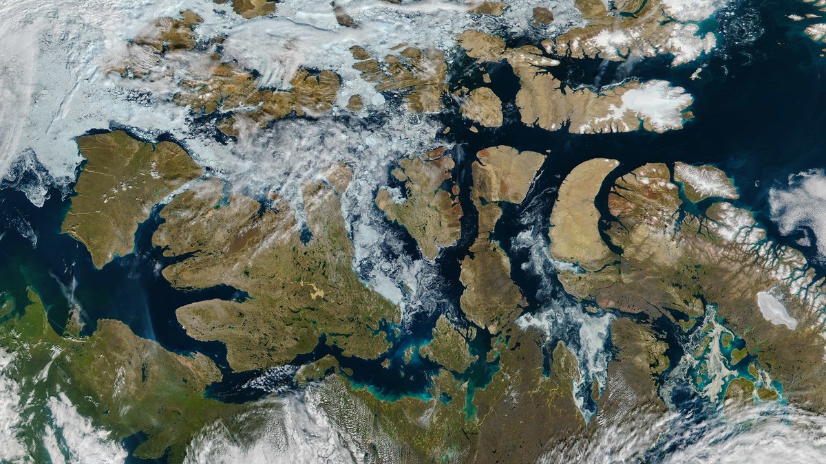
Canada holds first place with 202,080 kilometers in the Factbook-cited table. Its shores reach the Pacific, Atlantic and Arctic Ocean. The total includes a huge Arctic archipelago as well as mainland coast. Alberta and Saskatchewan are the country’s landlocked provinces. Every other province or territory reaches ocean waters or Hudson Bay and its connected waters.
Canada’s position reflects its geography. The Pacific coast has steep mountains, islands and sheltered channels. The Atlantic side includes gulfs and estuaries. Arctic islands add a broad network of channels and peninsulas. Each mapped edge contributes to the national coastline length. A long shore does not come from land area alone.
Government of Canada data gives 243,042 kilometers for the country’s Pacific, Atlantic and Arctic shores. That higher value does not overturn the table’s ranking. It records a different national dataset or measurement approach. The contrast makes an important point: every coastline figure needs its mapping rules beside it.
The difference also matters for practical work. A national inventory may include shorelines that a global comparison simplifies. Arctic islands are especially important in Canada because they add thousands of bays and channels. The global table provides one comparable reference. The Canadian figure provides a national reference for water, biodiversity and coastal management.
2. Indonesia and Norway show the power of islands
Indonesia ranks second at 99,083 kilometers in the World Bank table. Its many islands place a large share of the country beside the sea. Sumatra, Java and Kalimantan add major stretches of shore. Sulawesi and Papua add more. Thousands of smaller islands add still more. This sprawling archipelago contains beaches, reefs and mangroves. It also includes ports and channels across a vast area.
Norway ranks third with 58,133 kilometers. Fjords cut deeply into the land and multiply the shore that a map can trace. Islands and narrow channels add further distance. The country faces the North Atlantic and the Barents Sea. Coastal settlements have long relied on fisheries, shipping and travel between communities.
Islands and fjords affect a ranking in related ways. An island adds an outer edge. A fjord adds long walls of coast inside a narrow inlet. A more detailed survey can trace both features more closely. Countries with complex shores can therefore move sharply when another map scale or inclusion rule is used.
These landforms also affect life along the coast. Sheltered inlets can provide harbors. Reefs and mangroves support marine habitats in tropical waters. Fjord systems connect deep water with narrow coastal valleys. A coastline total cannot describe every one of these places, but it signals how much land-sea boundary a country must map and manage.
3. The remaining seven countries
The same table puts Russia fourth at 37,653 kilometers. The Philippines follows at 36,289 kilometers. Japan is sixth with 29,751 kilometers. Australia is seventh with 25,760 kilometers. These four entries combine broad mainland shores with islands, bays, or both.
The United States is eighth at 19,924 kilometers. New Zealand ranks ninth with 15,134 kilometers. China completes the top ten at 14,500 kilometers. The first three are Canada, Indonesia and Norway. Russia and the Philippines follow. Japan, Australia and the United States come next. New Zealand and China close the list. Every number comes from the same World Bank table and its Factbook-cited dataset.
Land area does not predict the order. A compact country with a smooth outline can have less shore than an island-rich country with less land. Coastal shape has equal weight. The ranking captures the number of islands, the depth of bays and the detail included along each land-sea boundary.
The figures are best read as a structured comparison. They do not measure the quality of a harbor or the health of a beach. They also do not describe how much of a coast is settled. Their value comes from applying one published country table across every entry in the list.
4. Why map scale changes the count
Imagine tracing a coast with a wide marker. The line passes over small coves and rock shelves. A fine pen enters those gaps and travels farther. This is the central map scale effect. More detailed maps reveal more bends. The measured line grows even when the shoreline itself has not moved.
NOAA describes this problem for the United States. Its official tidal shoreline figure is 153,646 kilometers. NOAA says totals can vary because shoreline definitions serve different purposes. Its count includes states, territories and islands. It also includes bays, rivers and creeks to stated limits. A list using a shorter outer-coast measure will produce a smaller total.
Mapping rules also decide how to treat estuaries, tidal channels and island groups. A method may trace the waterline at a defined tide level. It may also set a minimum size for features that count. These choices make a published number repeatable. They also explain why two accurate datasets can report different lengths.
Geoscience Australia states that the accuracy of a coastline length depends on map scale. Its boundary data identifies the dataset and scale used for the calculation. It also separates mainland from island coastlines. Those details make the total easier to interpret and compare.
Water level matters as well. Tides shift the visible edge of the sea through every day. Storms and sediment can reshape beaches over longer periods. A mapping program must choose the waterline it will use. That choice helps a survey produce a clear result that other users can repeat.
5. Coastline data guide real decisions
A coastline total does more than fill a ranking. Charts and shoreline data support navigation and coastal planning. They also support habitat mapping, disaster preparation and maritime boundaries. Accurate maps help mariners and public agencies work near the land-sea edge. They give scientists a way to document physical change through time.
Australia shows how purpose changes a total. Geoscience Australia describes about 34,000 kilometers of coast when small offshore islands are excluded. Its boundary dataset gives a larger value when island shores are counted. The agency’s coasts and estuaries information also shows how these places support ports, tourism and communities. A clearly stated method turns different totals into useful evidence.
Modern satellite mapping adds another view. Digital Earth Australia combines satellite data with tidal modeling to map annual shoreline positions from 1988 onward. Its coastline dataset tracks changes around beaches, river mouths, sandspits and tidal flats. These records connect a length on a map to the moving physical boundary where people and coastal ecosystems meet the ocean.
This type of monitoring helps separate two questions. One asks how long a coast is under a chosen rule. The other asks how the shoreline is changing through time. Both questions matter for communities that face erosion or flooding. Together they show why a coastline is a measured boundary and a changing physical place.
The largest coastlines remain striking. Canada leads this single-table ranking. Indonesia and Norway show how island networks and fjords extend a shore. The exact order can change when a survey uses another scale or inclusion rule. Reading the dataset name and method alongside the total gives every ranking its proper meaning.